Introducing the new and improved roster interface
Improved access to the information a coaches seeks
With the new roster, the goal is to enable busy coaches to find the information they are looking to glean about their athletes. This information ranges from at-a-glance opportunities to much more granular information for individual athletes. The coach can spend as much or as little time with this new roster without sacrificing access to quality statistics about his or her team.
Information Dashboard
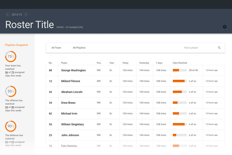
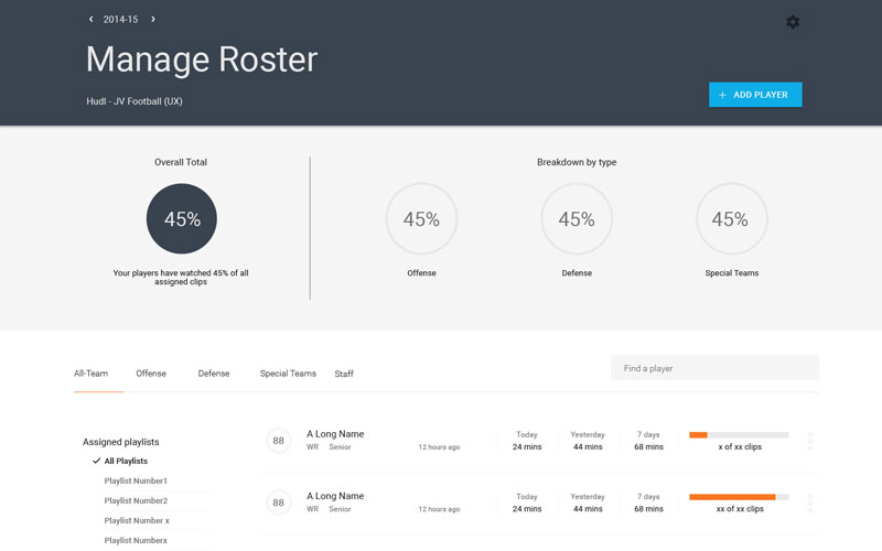
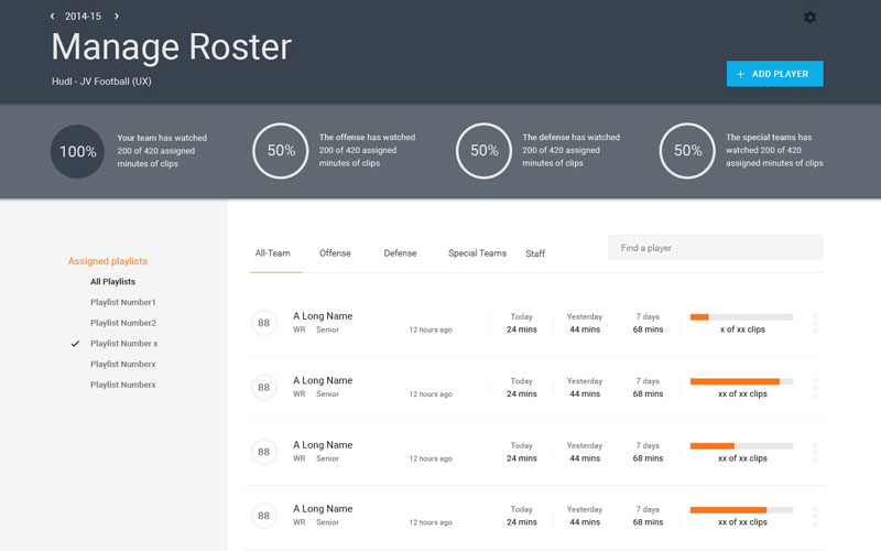
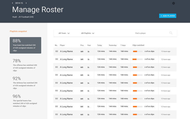
The information dashboard provides a quick glance at whether team members are watching their assigned videos or not. In the case of a football team the dashboard would display individual reports for the entire team, the offense, the defense and the special teams.
Individual Reports
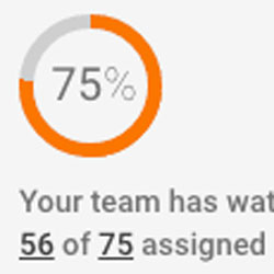
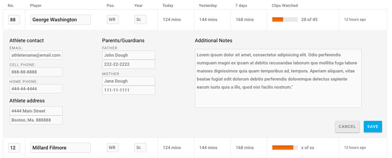
After the dashboard, the next information layer for a coach is the indicator that accompanies each, individual athlete. These graphics enable the coach to scan the entire list of athletes and quickly see who hasn't watched their assigned video playlists.
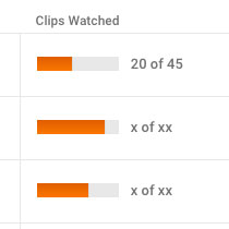
Athlete's Jersey
The previous interface displayed an athlete's avatar, but for a coach scanning a list of athletes, a jersey number is much more useful than that avatar photo. In many cases it's the jersey that is the main identifier for an athlete..
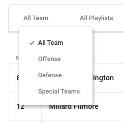
The Filter
The default state of the roster displays the entire team as well as well as all video activity. The roster filter bar allows a coach to, say, limit the view to only defensive players, or to limit to the players assigned to watch a specific playlist.
Additional Info
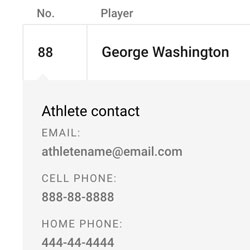
Clicking on an individual athlete displays additional information, including the athlete's contact info, his or her parents or guardians as well as any additional notes the coach as entered into the database.
Editing Tools
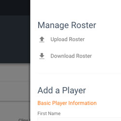
Uploading or downloading a roaster or adding a player to the team is only a click away. These tools are available only when the coach needs them, keeping the overall interface clean and focused.
The Design Process
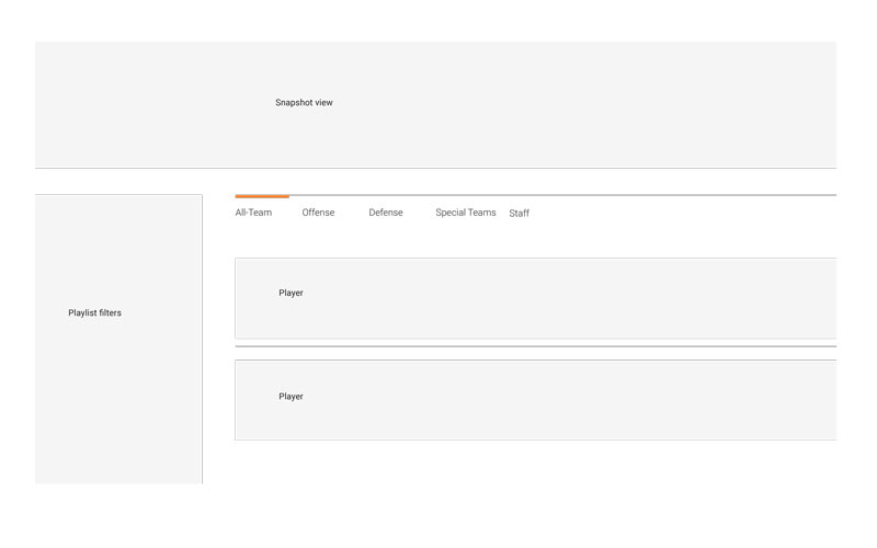
Starting from gray boxes and quickly progressing to more refined interfaces, the design process happened over the course of two nights and was refined enough to begin building yet open enough to allow for more design thinking within the development process.
The first design sketch included many of the ideas of the final interface, including the information dashboard and individual athlete graphics.
The next sketch visually refined the first sketch but had some lingering issues. Separating the playlist filtering and the filtering of the team itself seemed confusing and not as targeted as it should be.
By the third sketch the interface was more fully mature, the filtering lived within one focused area and each individual athletes listing was more refined.
Time to build the thing
With a solidified vision and refined design comps, I began writing some code. Rather than slowing myself to define the prototyping environment, I jumped into codepen and began building. The initial codepen sketch more closely resembles the designed comps. However, through this initial development exploration, I realized there were still place to tighten the interface, and opted to place adding players and other roster management behind a side navigation.